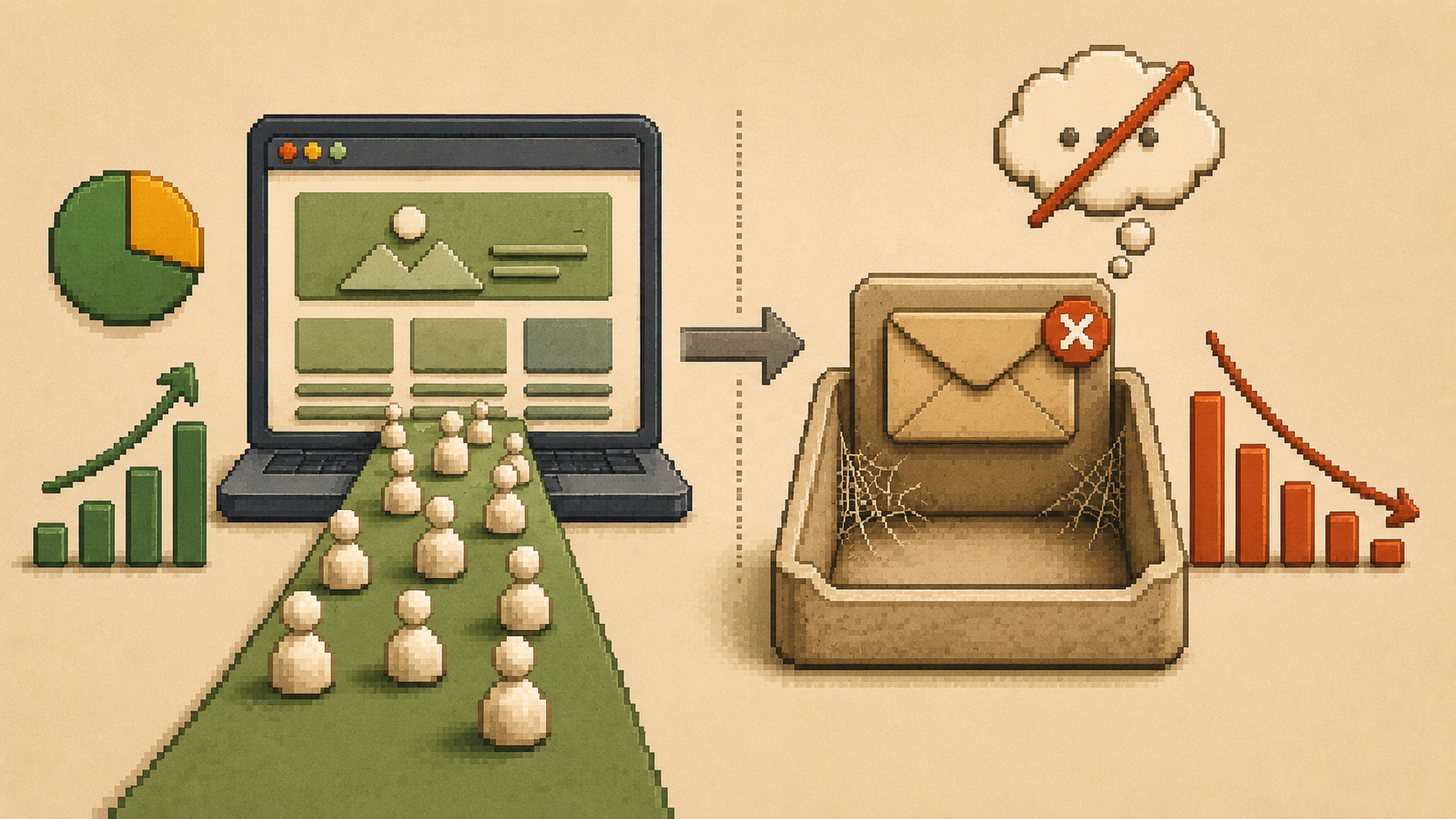
You open your analytics and the numbers look fine. People are finding your website. They're landing on your pages, sometimes spending a couple of minutes reading. But your inbox stays quiet. The phone doesn't ring. The contact form collects dust.
If this is your situation, the instinct is usually to drive more traffic. Run ads. Post more on social media. Get more people to the site. But more traffic going to a page that doesn't convert just means more people leaving without reaching out.
A website that gets traffic but no inquiries is not a traffic problem. It is a conversion problem. And the fix is almost always closer than most business owners expect.
The Real Reason Visitors Don't Inquire
Why is my website getting traffic but no leads?
Visitors decide whether to stay or leave within 50 milliseconds of landing on a page. Before they've read a sentence, before they've seen your portfolio, before they've found your contact details, they've already made a first impression judgment based on what they see.
If what they see doesn't immediately feel relevant, credible, and clear, most of them leave. Not because they weren't interested. Because nothing grabbed them fast enough to make them stay.
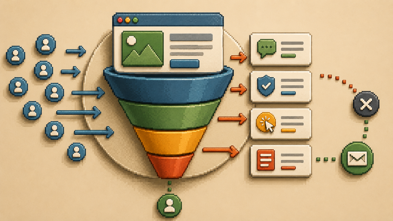
There is a second, slower filter that eliminates another group of visitors. These are the people who do read your page, maybe even spend a few minutes on it, but still don't reach out. They were interested enough to look. Something stopped them from taking the next step.
That something is almost always one of four things: unclear messaging, missing trust, a weak or buried call to action, or friction in the contact process.
The average website conversion rate across industries sits at around 2.9%. Most small business websites convert well below that. If you are getting consistent traffic and no inquiries, fixing the conversion problem is almost always faster and cheaper than buying more traffic.
Problem 1: Your Messaging Isn't Clear Enough
What does unclear website messaging look like?
The most common conversion killer on small business websites is a homepage that doesn't say, in plain language, what the business does, who it's for, and what problem it solves.
Business owners tend to write their own homepage copy in one of two ways. Either they write what they think sounds professional, which usually produces vague phrases like "solutions-focused," "passionate about excellence," or "your trusted partner in growth." Or they write what they know about themselves, which usually produces a list of services and credentials without connecting to what the visitor actually cares about.
Neither approach works.
Visitors don't read carefully. They scan. And if they can't find a sentence in the first few seconds that makes them think "yes, this is for me," they move on.
A weak opening:
"We are a passionate team of creative professionals delivering excellence in web design."
A stronger opening:
"We build websites for service businesses that want to stop losing clients to competitors with better-looking sites."
The second version is specific.
It identifies the client, names the problem, and states the solution. A visitor who matches that description knows immediately they're in the right place.
Fix this in ten minutes: Read your homepage headline out loud. Then ask: does this sentence describe exactly who I help and what I do for them? If it could apply to any business in your industry, rewrite it until only your business could have said it.
Problem 2: Visitors Don't Trust You Yet
What trust signals are missing from most websites?
Before anyone sends an inquiry, they run a quiet background check on your business. They want to know: is this real? Is this someone I can trust with my money? Has anyone else worked with them and had a good experience?
If your website doesn't answer those questions, visitors hesitate. And most hesitating visitors don't come back.
Trust signals that actually move people toward action include:
Specific, outcome-focused testimonials.
A testimonial that says "really great to work with" does almost nothing. A testimonial that says "we saw our inquiry rate double within six weeks of the new site launching" tells a story with a result. The specificity is what makes it believable. Research shows that trust signals such as testimonials and case studies placed near calls to action can increase conversion rates by 15 to 34%.
Case studies.
A short before-and-after story, what the client needed, what was built, and what changed for their business, gives prospective clients a way to see themselves in the outcome.
A visible human face.
In the age of AI-generated content, people crave authenticity. A photo of the actual person behind the business does more for trust than any number of words.
Visible contact information.
A phone number, a real email address, and a business address tell visitors a real business exists. Hiding contact details creates doubt that visitors don't voice but always feel.
HTTPS security.
If your website still shows a security warning or lacks an SSL certificate, fix this before anything else. Visitors see the padlock icon before they read your headline.
Trust audit: Count the specific, outcome-based testimonials currently visible on your homepage. Not buried on a separate testimonials page. Visible on the homepage. If the number is zero or one, that is your most urgent conversion fix.
Problem 3: No Clear Next Step
Why do interested visitors still not contact me?
You can have the clearest messaging and the strongest testimonials in your industry and still lose inquiries if you don't tell people what to do next.
Most websites bury their call to action at the bottom of the page, word it too generically to feel compelling, or have so many competing options they create decision paralysis.
A visitor who lands on your homepage, reads with interest, and then has to hunt for a contact link has already had a friction experience. Some will hunt and find it. Many won't.
Your most important call to action belongs at the top of your homepage, visible without scrolling, on both desktop and mobile. The wording matters enormously. "Contact us" tells the visitor what to do for you. "Book a free 30-minute call" tells them what they get and why it's worth doing.
Research shows that a specific, clear call to action can increase conversion rates by up to 161% compared to a generic one. That is not a minor improvement. That is the difference between a site that works and one that doesn't.
Fix this right now: Look at your primary homepage CTA button. If it says "contact us," "get in touch," or "submit," rewrite it to describe what the visitor receives. This single change takes under five minutes and can produce measurable results within days.
Problem 4: The Contact Process Has Friction
What stops people from filling in a contact form?
Some visitors get all the way to your contact page and still don't reach out. This is often a friction problem in the final step.
Common causes:
contact forms that ask for too much information before the conversation has even started. Asking for a budget, project timeline, industry, company size, and three paragraphs of project description before you've said hello is too much. A name, an email, and one open question is usually enough to start a productive conversation.
Other friction points:
a contact page with no context or reassurance, a phone number that isn't clickable on mobile, or no response time expectation set anywhere on the page. Adding a single line like "we typically respond within one business day" removes the uncertainty that stops people from submitting.
How to Diagnose Where Your Problem Is
How do I know what is causing my low conversion rate?
You don't need expensive tools. Start with these three checks.
The five-second test.
Ask someone who doesn't know your business to look at your homepage for five seconds and then close it. Ask them to tell you in one sentence what your business does and who it helps. If they can't answer clearly, your messaging needs work before anything else.
Check your exit pages in Google Analytics.
Exit pages are the last pages visitors view before leaving. If a large percentage of visitors exit from your contact page, something on that page is stopping people who were already interested from following through. That is a friction problem, not a messaging problem.
Check your bounce rate by page.
A high bounce rate on your homepage means people aren't finding what they came for. A high bounce rate on your services page means people are reading but not being moved to act. These two problems have different causes and different fixes.
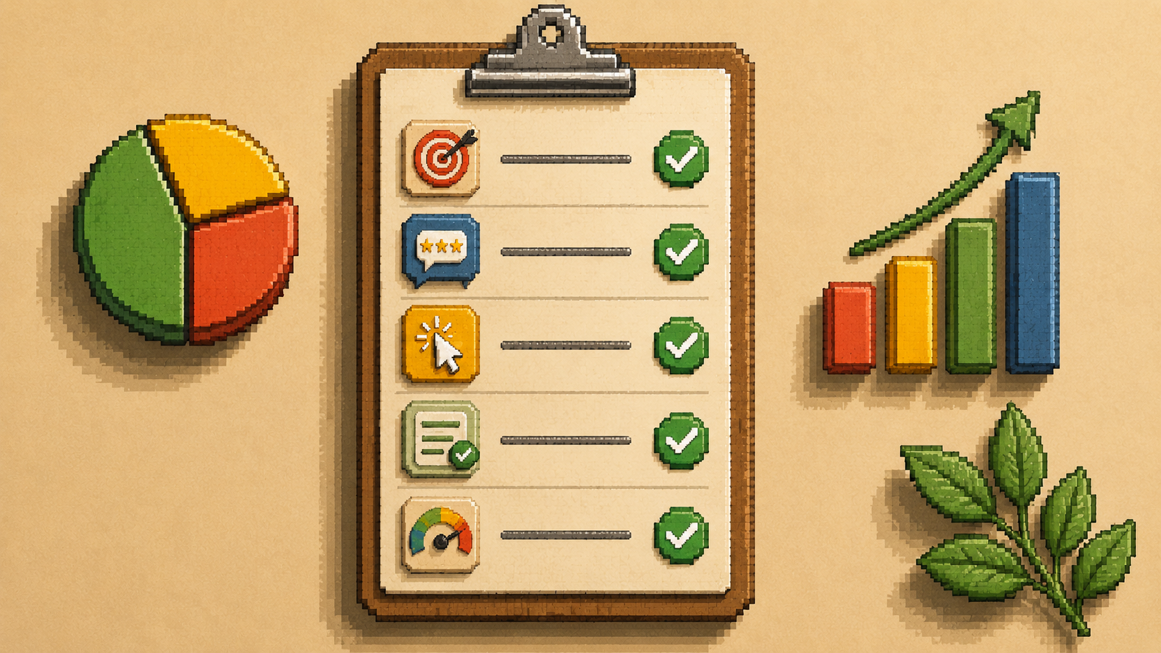
Your Conversion Diagnostic: Do This Today
Run this five-question check on your current website.
Score one point for each yes.
- Does your homepage headline immediately tell a stranger what you do and who you help?
- Is there a specific, outcome-based testimonial visible on your homepage without scrolling?
- Is your primary call to action visible above the fold on both desktop and mobile?
- Does your contact form ask for three fields or fewer?
- Does your website load in under three seconds on a mobile connection?
Score 5: Your conversion foundation is solid. Focus on driving more of the right traffic.
Score 3 to 4: One or two fixable problems. Start with your lowest-scoring item.
Score 2 or below: Your website is losing you inquiries every week. The fixes are available and most don't require a full rebuild.

