
Most business websites do not fail dramatically. There is no crash. No error message. No moment when the owner realizes something has gone wrong. The failure is quiet, invisible, and ongoing. Visitors arrive every day, look around for a few seconds, and leave without reaching out. The inbox stays quiet. The phone does not ring. And the owner keeps assuming the problem is traffic.
It is almost never traffic.
Most business websites do not fail because of poor design. They fail because they were never built to convert in the first place. They look good. They have content. They exist online. But they do not generate leads, enquiries, or revenue. And that is the real failure. Amitray
The data on this is consistent and significant. Studies show that over 80% of business websites fail to generate leads, sales, or meaningful online engagement. Many look professional, but they lack strategy, clear messaging, and a proper conversion-focused structure. Store Transform
A business website fails not when it looks unprofessional but when it was built to describe rather than convert, structured around what the business wants to say instead of what the visitor needs to understand before they will act. Most website failures are not design failures. They are strategy failures that no amount of visual improvement can fix.
This guide is the honest, data-backed explanation of why most business websites fail, what the specific failure patterns look like, and how to diagnose which ones apply to your site before spending another dollar on traffic, ads, or a redesign.

The Failure Is Almost Never What Business Owners Think It Is
Why do most business websites fail to generate leads?
Businesses often focus heavily on driving traffic to their website. SEO campaigns target rankings. Paid advertising increases clicks. Social media expands reach. While these activities are important, they only solve the first part of the problem. Traffic alone has no value if visitors do not convert. This is where many websites break down. They attract users successfully but fail to create a clear pathway from interest to action. Visitors arrive with intent, but the website does not help them progress confidently toward an enquiry. The result is friction, hesitation, and abandonment. Medium
The instinct when a website is not generating results is to drive more traffic. Run more ads. Post more on social media. Invest more in SEO. But sending more visitors to a site that does not convert is expensive in exactly one way: it costs money to learn nothing useful.
The conversion problem, which is the failure to turn visitors into inquiries, is almost always a website problem, not a traffic problem. And the website problem is almost always one of five specific patterns that appear consistently across failing service business websites regardless of industry, geography, or budget.

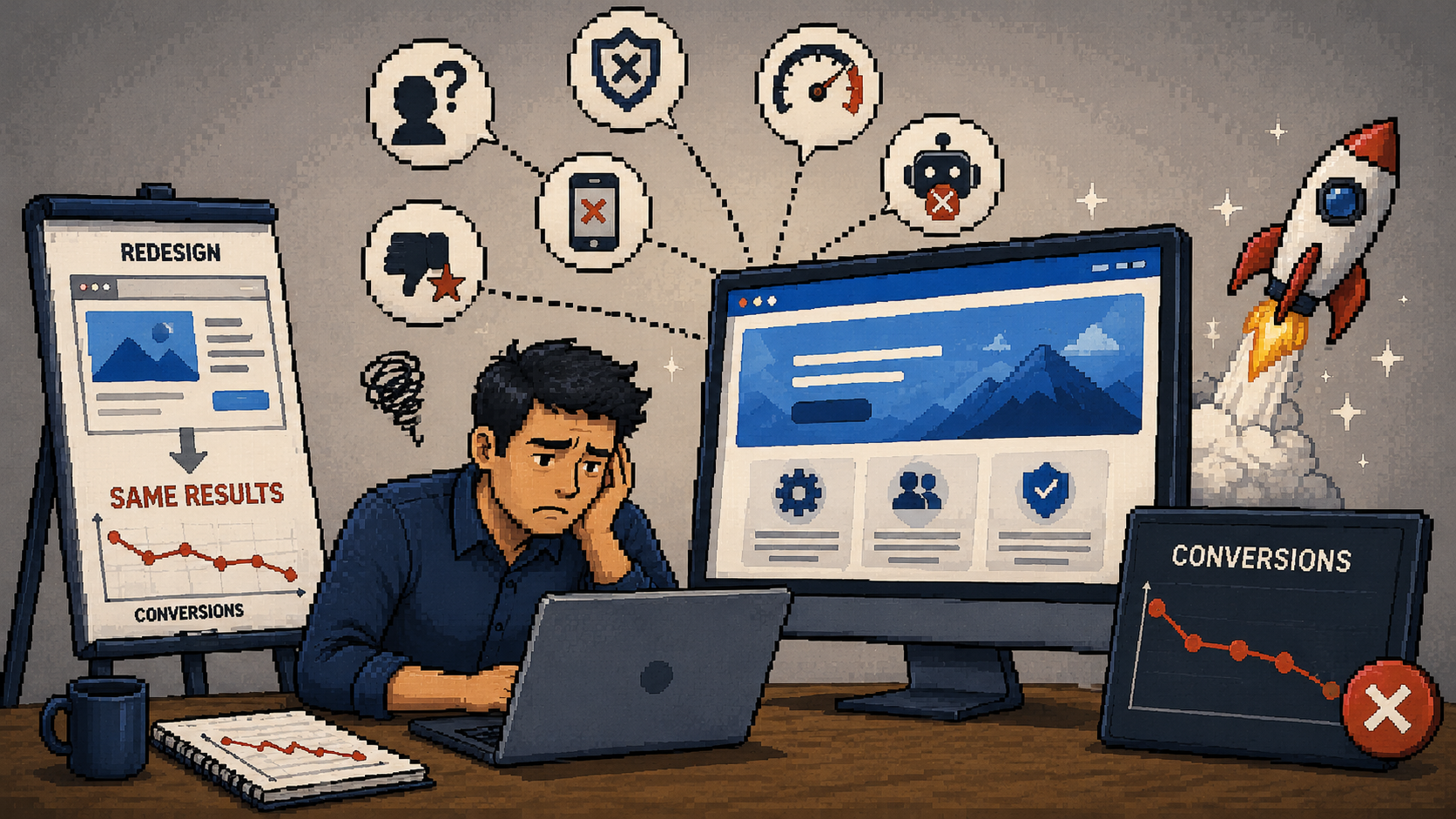
The Five Patterns That Explain Almost Every Failure
What are the most common reasons business websites fail to convert?
Pattern 1: Unclear messaging in the first five seconds.
Most websites are built around what the business wants to say, not how customers actually think. Within the first few seconds, a visitor should be able to answer: what does this business do, is this for me, and what should I do next? If they cannot answer those questions immediately, your website is creating friction. And friction kills conversions. Isynbus Technologies
The five-second test is the most revealing diagnostic available for any homepage. Ask a person who has never seen your website to look at it for five seconds and then close it. Ask them what the business does. If they cannot answer clearly, your first impression is failing. Not because the design is bad. Because the messaging is not specific enough to be understood at a glance.
This is the most common failure pattern and the most fixable. It does not require a redesign. It requires a rewrite of the homepage headline and the first section of content.
Pattern 2: No specific, verifiable trust signals.
The psychology behind conversions has not changed: people act when they feel informed, confident, and understood. Social proof including testimonials, case studies, and reviews remain powerful motivators. Rising Tide Creatives
Before any visitor reaches out, they run a quiet background check. They want to know whether anyone else has worked with this business and whether it ended well. Generic testimonials that say "great to work with" or "very professional" pass the existence check but fail the credibility check. They signal that someone worked with the business. They do not signal that the work produced a meaningful result.
Specific, outcome-referenced testimonials, "we went from two web inquiries a month to eleven within three months of the new site launching," build the kind of trust that moves people from interest to action. Most service business websites either have no testimonials at all or have only the generic variety. Both represent a conversion gap that can be closed without touching the design.
Pattern 3: Weak or absent calls to action.
The biggest mistake businesses make is focusing on design over strategy. A modern layout, attractive images, and smooth animations are valuable but they do not guarantee conversions. If the messaging is unclear, the user journey is confusing, or the offer is not compelling, visitors will leave. Stackmatix
A call to action is the instruction that tells a visitor what to do next. Without one, even genuinely interested visitors often leave. Not because they are not interested. Because the next step was not obvious.
Most websites bury their call to action at the bottom of the page, word it too generically ("contact us," "learn more," "submit"), or present so many options on a single page that no single action feels clear or compelling. Research consistently shows that repositioning a call to action above the fold and rewriting it from a generic instruction to a specific benefit ("book a free 30-minute strategy call" versus "get in touch") produces measurable conversion improvement without any other changes.
Pattern 4: Slow load times and poor mobile experience.
More than 53% of users will simply leave a page if it takes more than 3 seconds to load, and a delay of just 1 second decreases conversions by 7%. Frase
Over 60% of traffic to websites is mobile. Not only is this category of traffic growing rapidly, but the consequences of poor mobile experiences can exceed a 50% bounce rate. Frase
Speed and mobile performance are not design problems. They are structural problems that exist independently of how the site looks. A beautiful, professionally designed website can be slow and mobile-unfriendly. A simple, minimal site can be fast and flawless on mobile. These are build decisions, not design decisions, and they affect conversions before a visitor has read a single word.
Pattern 5: No AI visibility layer.
This is the failure pattern that most businesses are not yet aware of. A growing and significant percentage of potential clients are finding businesses not through Google's traditional search results but through AI tools like ChatGPT, Perplexity, and Gemini. A failing website does not just sit idle. It quietly costs you traffic, leads, and revenue every single day. Store Transform
Websites built before 2024 were almost universally built without any consideration of AI visibility. No AI crawler permissions in robots.txt. No schema markup. No answer-structured content. No entity consistency across platforms. This means that even a website that performs reasonably well in traditional Google search may be completely invisible to the AI tools that an increasing number of buyers are using to find and evaluate service providers.
The Redesign Trap
Why does a website redesign often fail to fix the conversion problem?
Most website redesigns produce a better-looking site with the same conversion rate. The problems are structural, not aesthetic. The problem is not the design quality. It is that the redesign addressed the wrong variables. Conversion rate is determined by clarity, trust, and friction reduction. Most redesigns optimize for visual appeal and brand consistency. The two objectives are not the same. Envy Design Co.
This is the most expensive pattern in the entire website failure landscape. A business identifies that its website is not performing, invests in a full redesign, and launches the new site with real excitement. Three months later, the conversion rate is the same. Sometimes it is lower.
In a twelve-month period reviewing redesign briefs and pre-launch and post-launch performance data from sixty-plus clients, fewer than 25% of completed redesigns produced a measurable improvement in conversion rate. Most produced no change. A significant minority produced a decrease, typically caused by page speed regression on the new build or by removing content elements that were contributing to conversion. Envy Design Co.
The pattern repeats because the redesign solved the wrong problem. The site looked better. But the messaging was still vague. The trust signals were still generic. The call to action was still buried. The mobile experience was still frustrating. The AI visibility layer was still absent. Design changed. The problems did not.
The correct sequence is to diagnose the actual failure pattern first, then determine whether the fix requires a redesign or whether it can be addressed through targeted content and structural changes on the existing site.

The Diagnostic You Can Run Today
How do I diagnose why my website is failing?
You do not need expensive tools or technical expertise to diagnose the most common failure patterns. You need honest answers to five questions about your current site.
Question 1: The five-second test.
Ask someone who has never seen your website to look at your homepage for five seconds. What does this business do? Who does it help? What should I do next? If they cannot answer all three clearly, your messaging is the primary failure point.
Question 2: The trust signal count.
How many specific, outcome-referenced testimonials are visible on your homepage without scrolling? If the number is zero or one, trust signals are a significant gap.
Question 3: The CTA visibility test.
Open your homepage on your phone without scrolling. Is there a specific, benefit-stated call to action visible in the first screen? If not, your call to action is contributing to conversion loss.
Question 4: The speed test.
Go to pagespeed.web.dev and enter your URL. What is your mobile score? Below 70 means your site is losing visitors before they read anything.
Question 5: The AI visibility check.
Open ChatGPT and Perplexity. Ask five questions your ideal clients would ask about your category. Does your business appear in any response? If not, you are invisible to an increasingly significant portion of buyer research.
Score yourself. Each no is a specific, addressable problem. The pattern of your nos tells you where to focus first and whether the fix requires a redesign or targeted optimization on your existing site.

What the Data Says About Recovery
Can a failing website be fixed without rebuilding it?
Often yes, and more quickly than most business owners expect. In 2026, customers are doing more research than ever before. They are comparing. They are checking. They are deciding before they reach out. Your website sits at the centre of that process. And when it is clear, structured, and built properly, it makes everything else in your marketing work better. Isynbus Technologies
The fixes that produce the fastest results are almost always at the surface layer: sharpening the homepage headline, replacing generic testimonials with specific ones, repositioning the call to action, and restructuring key page sections to lead with direct answers. These changes can be made without a redesign and typically produce visible results within two to four weeks on a site with existing traffic.
The fixes that require more time and investment are structural: platform migration for sites with speed problems that cannot be optimized, schema markup implementation for AI visibility, full content restructuring for sites with deep messaging problems, and AI crawler access configuration.
At PixelSeed, every engagement begins with a diagnostic audit of all five failure patterns before any recommendation is made. We diagnose first. We propose only after we understand specifically where the site is failing and whether the fix is a surface optimization or a structural change. That distinction determines everything about what the right investment looks like.

